
Project 1:
Sweets Company Branding & Multimedia Project
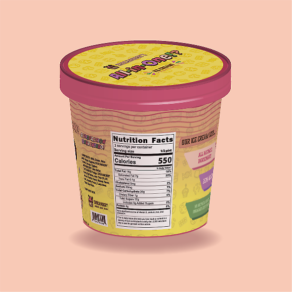
CHOCANDERY
Adobe Illustrator & Adobe After Effects
Project Overview & Beginnings
The goal for this project was to create a fun and playful brand identity for a fictional sweets company: Chocandery. I created this made-up company because I love baking and all things sugar. I also knew from the beginning that I wanted this brand to specialize in all three main areas of sweet treats, instead of just one. Hence the name, that combines chocolate, candy, and bakery into one new and unique word. But the challenge came when I had to come up with a logo design that would encompass all of that, while still being simple and recognizable. So, let’s walk through my logo process!
The Logo & Brand Identity
Step 1: Research & Planning
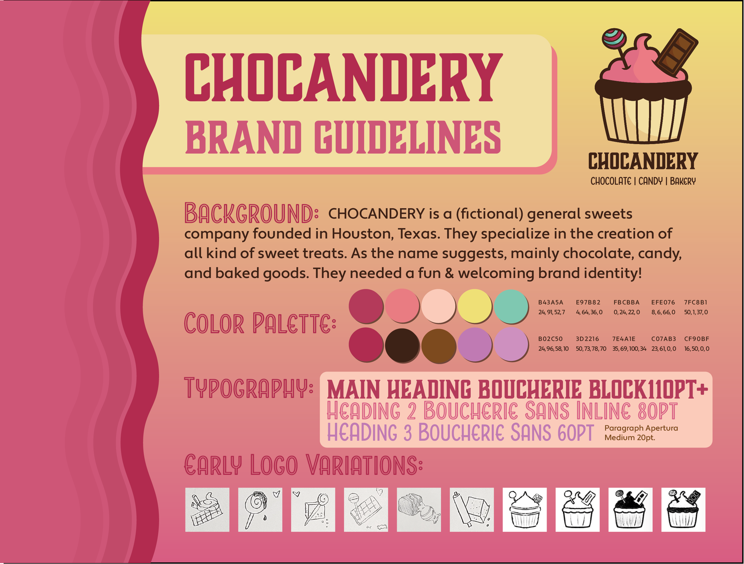
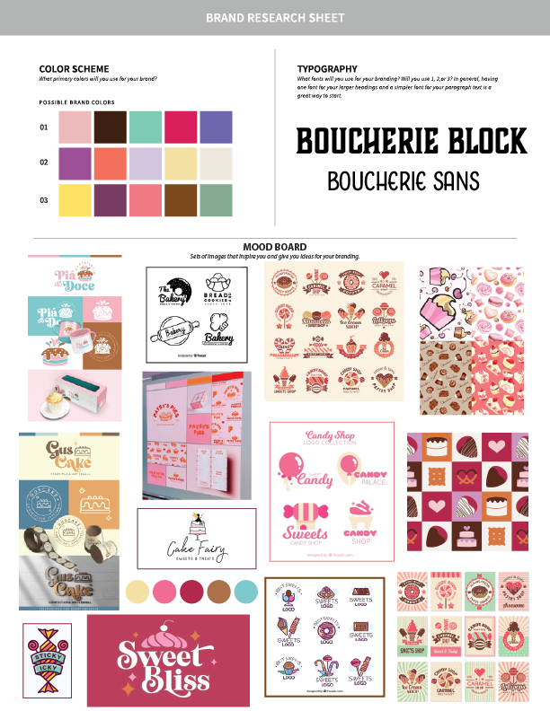
Now when it came to considering typography for this brand, I wanted to be a bit different. Most of the brands I found used fancy script lettering in their fonts. I wanted something blocky and bold; reminiscent to an old-fashioned candy parlor/confectionary/chocolate factory vibe. And then I found a beautiful font family on Adobe Fonts called Boucherie, which checked all of my requirement boxes.
Step 2: Sketches & Iterations
I decided to further explore this sketch in a digital space, so I opened up Procreate on my iPad, grabbed my Apple Pencil, and got to refining. I tried a cut-out style due to its simplicity and recognizable silhouette, but it didn’t work as well with multiple intersecting objects. So, I drew it in a way where you can see exactly where they enter the cake. Then I thought the lollypop and the chocolate needed patterns inside, otherwise it may look too flat. I wanted dimension.
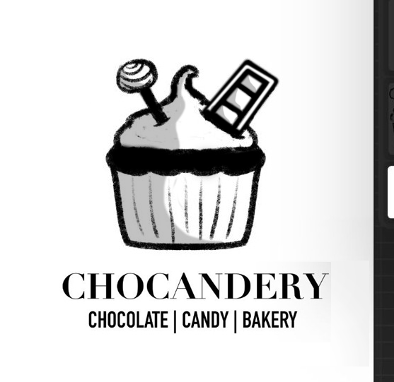
In Adobe Illustrator, I built the Chocandery Logo over my imported sketch using the pen tool, shapes tools, the shape builder tool, and pathfinder. For outlines and strokes I expanded their appearances and united them with intersecting shapes to create new complex paths. Once the linework was complete, I duplicated my artboard so that I will have a separate black and white version before I add color with the live paint bucket tool. (If the logo does not work in black and white, the logo has failed).
My primary step in building a brand identity is to always research other similar brands and companies first. This is to draw inspiration from other’s work and see what my competition is going to be. Part of this stage was about taking screenshots of designs I like, and creating a mood board from those images. On the right is a document I made for myself to work on as a planning page during this step.
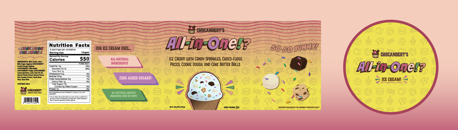
Notice how brands that revolve around sweets tend to use colors such as pink and yellow. I didn’t only choose my palette based off this, but a bit of color psychology. Pink evokes feelings of playfulness and inner child, while yellow is proven to make people feel hungry, making this a great combo for a company that makes fun desserts. I wanted to dive into color theory as well and explore purple and teal as they are complimentary colors to pink and yellow. And thus, my color palette was decided. Had to throw in some dark brown for the chocolate aspect, which worked out for my strokes and outlines later on as opposed to black.
Step 3: Adobe Illustrator
Once the initial research was done, it was time to get some ideas on paper. I do admit, I was having trouble combining the three areas of sweets for a while and could only combine two at a time. While I came up with keywords, different objects that could visually describe each area, it hit me. I was thinking too hard about this. What if I literally just stuck them all together? That’s when the idea of the lollypop and chocolate bar as garnishes or “toppings” for a cupcake came about.
The chocolate bar gave me the most trouble with how to draw the inside, I wanted the pieces to be clearly separate, like when you break off a piece to share with friends. I realized having more white space in the center looked better for that idea. Once I was happy with the basic outline, I planned out where all of the shading would go. Then, I was ready to make it pixel perfect in Illustrator!
